
QR Coupon
Track performance
Codes that you can’t measure are just decoration. QR Coupon → Analytics turns every scan into a number you can act on — what got scanned, what converted, what it earned, and who bought. It’s five views: an Overview, then four breakdown tabs — QR Codes, Products, Campaigns and Customers — and every one of them lets you click through to a deeper detail view. Pro
One control sits above every view: the date range. Pick All time, Last 7 / 30 days, This / last month, or type a custom from–to, and everything below — overview, tables and detail pages alike — recalculates to that window. On a bounded range the KPI tiles also show a delta vs the previous period (↑ / ↓ / New).
The overview
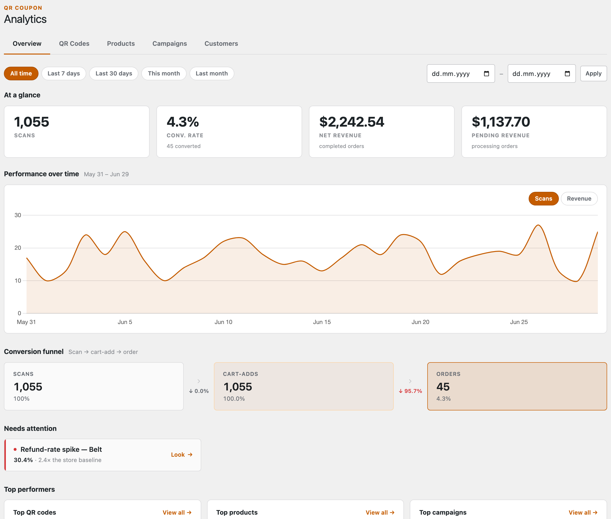
The Overview stacks five blocks, top to bottom:
- At a glance — total scans, conversion rate, net revenue from completed orders, and pending revenue still sitting in processing orders.
- Performance over time — a daily curve you can flip between Scans and Revenue.
- Conversion funnel — scan → cart-add → order, with the drop-off called out at each step so you can see where people fall away.
- Needs attention — automatic flags so a problem finds you. Three kinds: a refund-rate spike on a product, an out-of-stock hotspot (scans landing on a sold-out item), and dead QR codes (created long ago, never scanned). Each links straight to the thing it’s warning you about.
- Top performers — your best QR codes, products and campaigns, each a shortcut into the detail views below.
The breakdown tabs
The four breakdown tabs slice the same scan data different ways, and they all behave the same: a sortable table (click any numeric heading), a search box and filters, and the shared date range. The important part is that every row is a doorway — click it and you drop into a detail view for that one code, product, campaign or customer. Products, campaigns and customers then drill one level further, down to the individual code’s scan-by-scan history. Here’s each tab and what opening a row reveals.
QR Codes
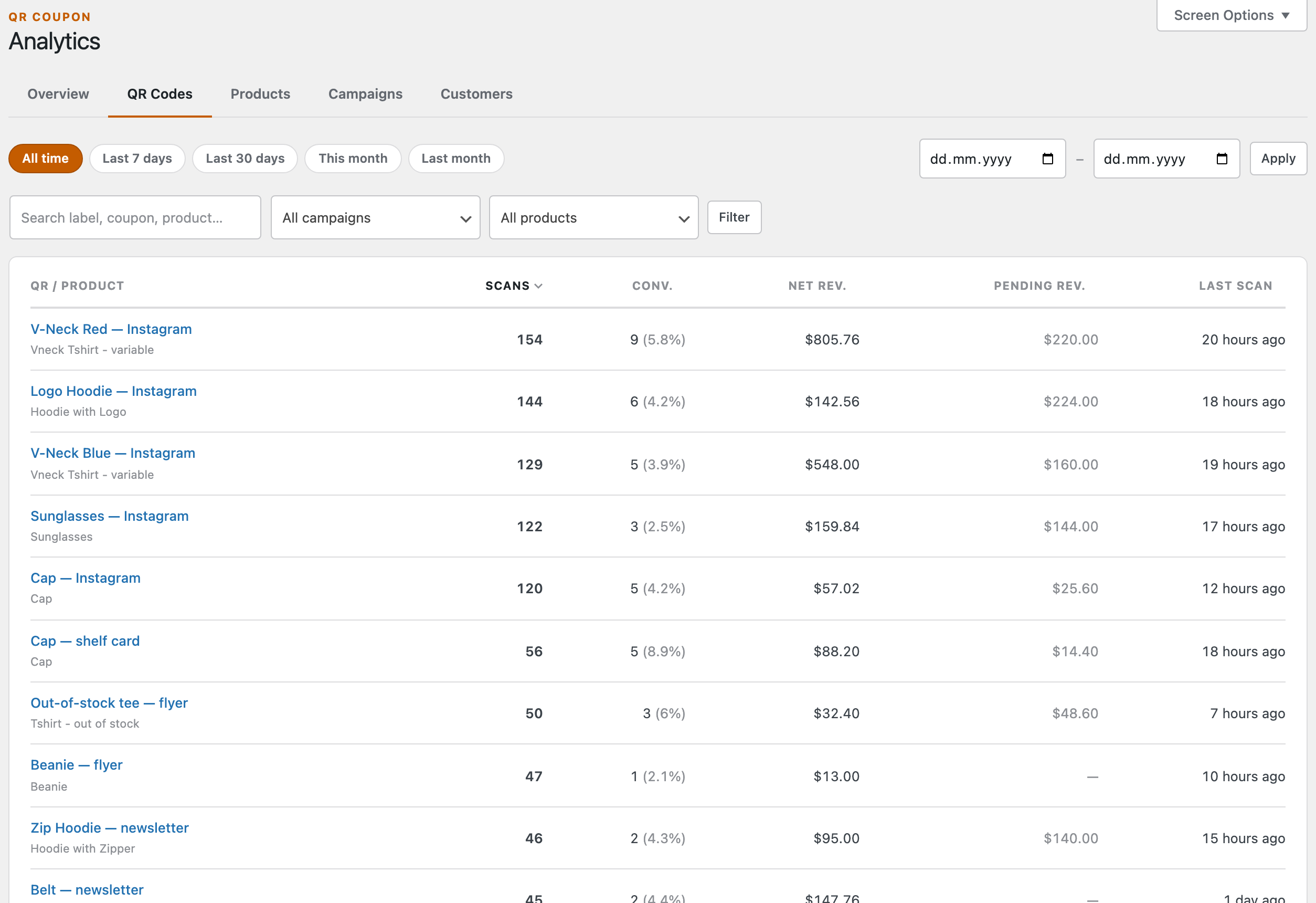
The master list of every code: scans, conversions (count and rate), net and pending revenue, and when it was last scanned. Sorted by scans out of the box; narrow it with the search box or the campaign and product filters.
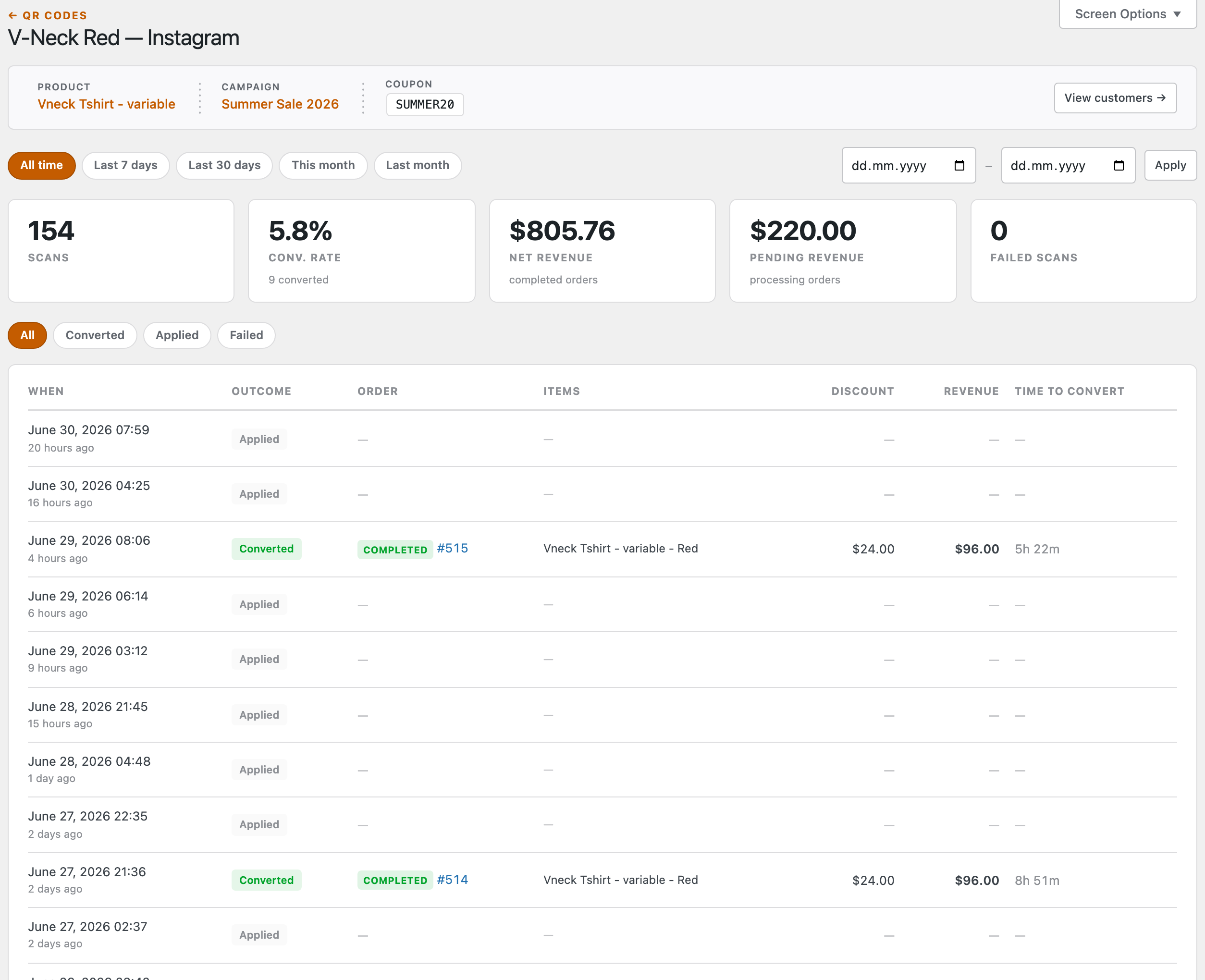
Click a code to open its detail page — the richest view in Analytics. Up top: its product, campaign and coupon, plus KPI tiles including failed scans (with the reason, e.g. out of stock or invalid link). Below, a scan timeline — one row per scan — that you can filter to Converted, Applied or Failed, each row showing the outcome, the linked order, the items, the discount realised, the revenue, and the time from scan to order. A View customers → button jumps to the people this one code brought in.
Products
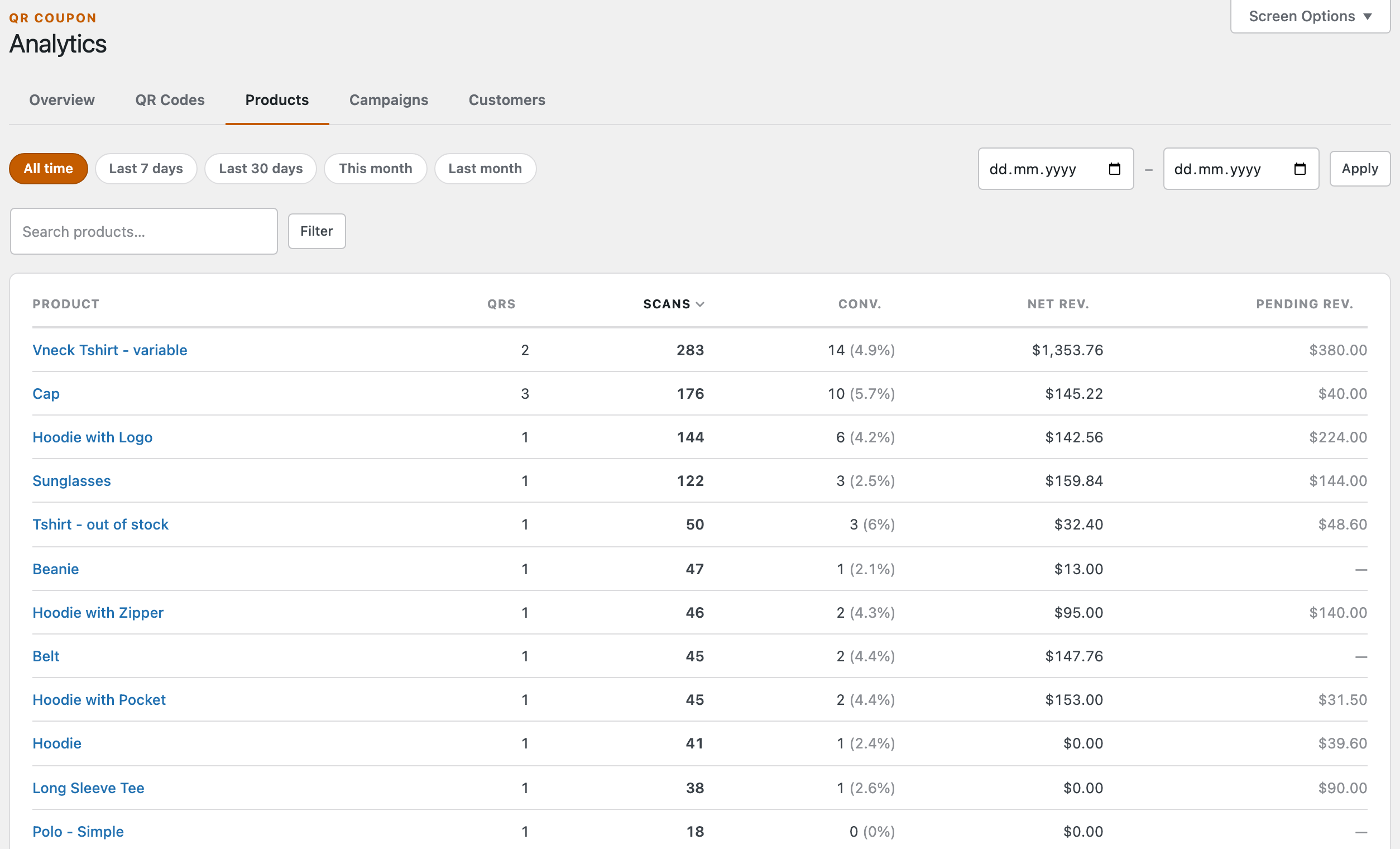
Rolls every code up to the product it sells, so you see which products your codes actually move — not just which get scanned. The QRs column counts how many codes point at each one.
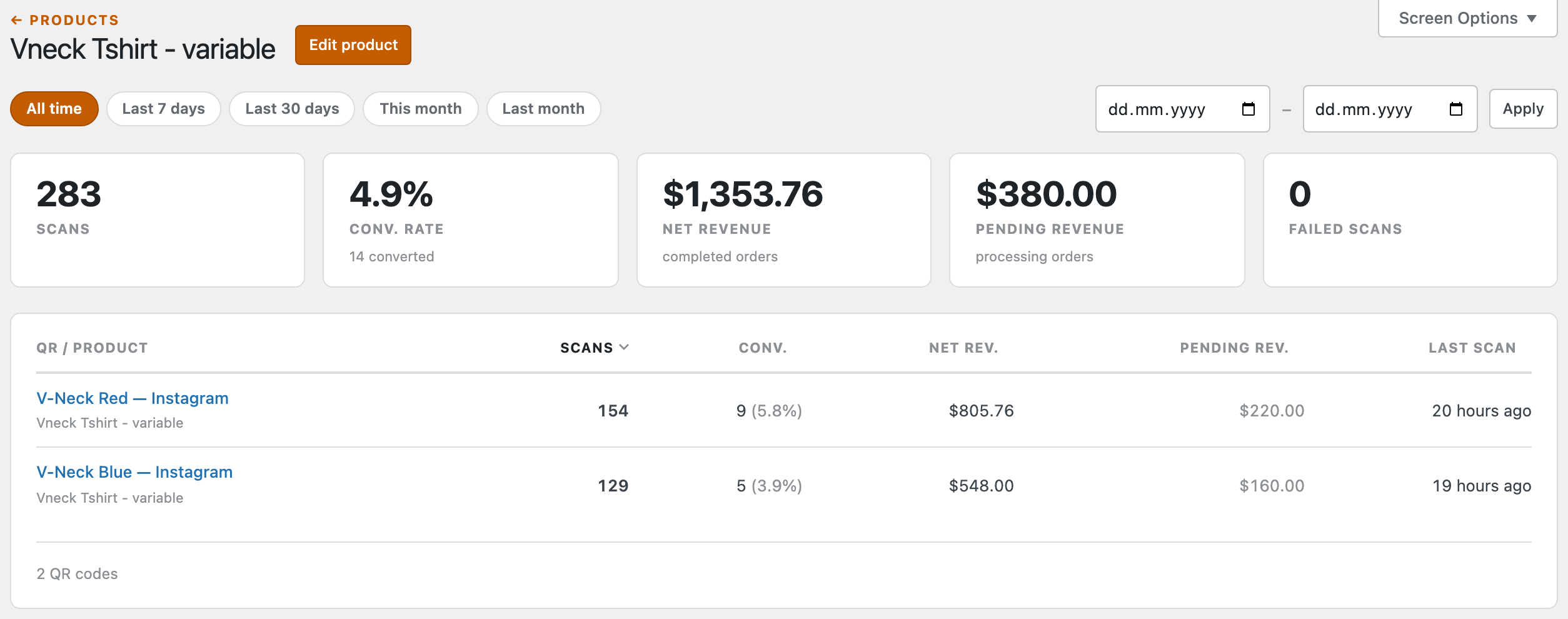
Opening a product gives you its own KPI tiles and the list of every code that points at it. Each of those rows drills one level deeper into the same scan timeline you saw under QR Codes — so you can go from “this product earned £1,350” to “…and this is the exact scan that did it” in two clicks.
Campaigns
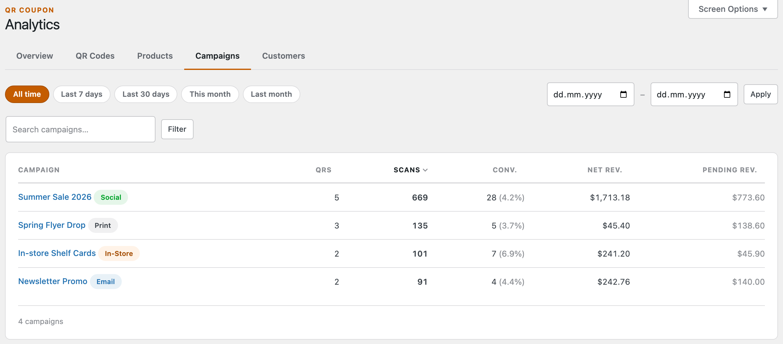
Performance per campaign, each tagged with its channel — so you can line a print drop up against a social push or an email blast and judge them on revenue, not gut feel.
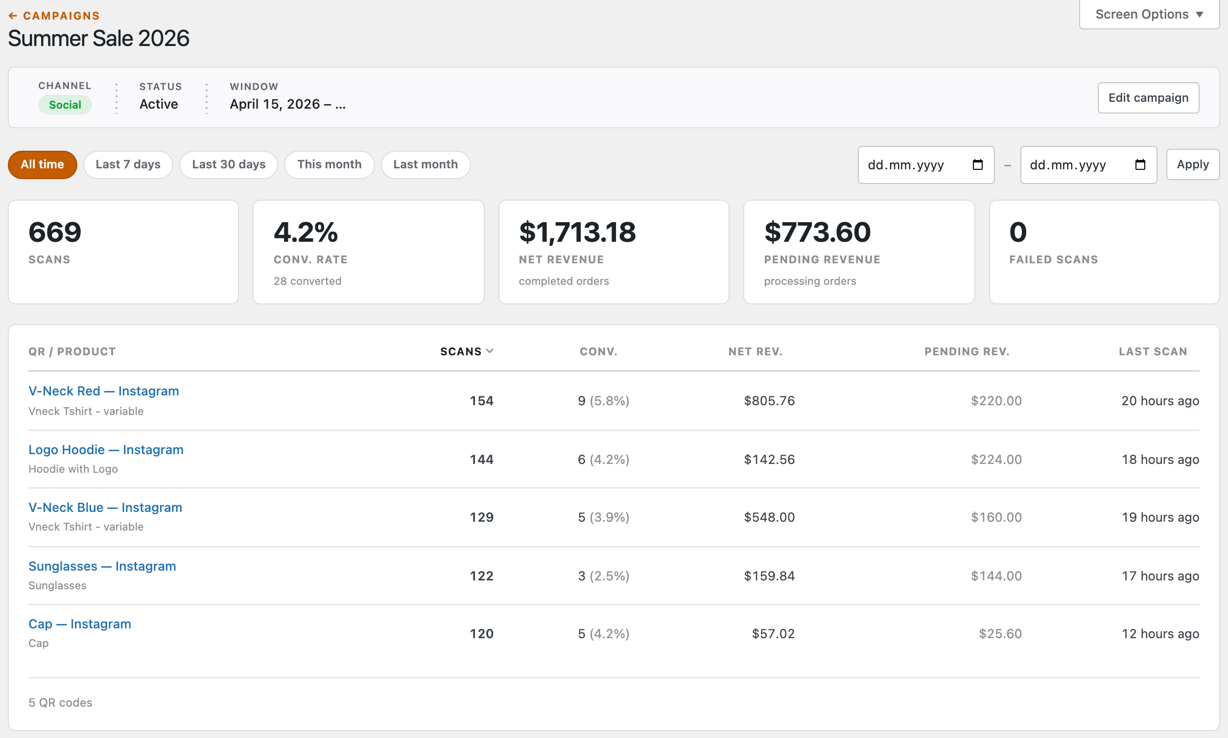
Open a campaign for its channel, status and run dates, its totals, and the codes inside it — and, again, each code drills down to its own scan history. (This is the analytics twin of the campaign you set up on the Campaigns screen.)
Customers
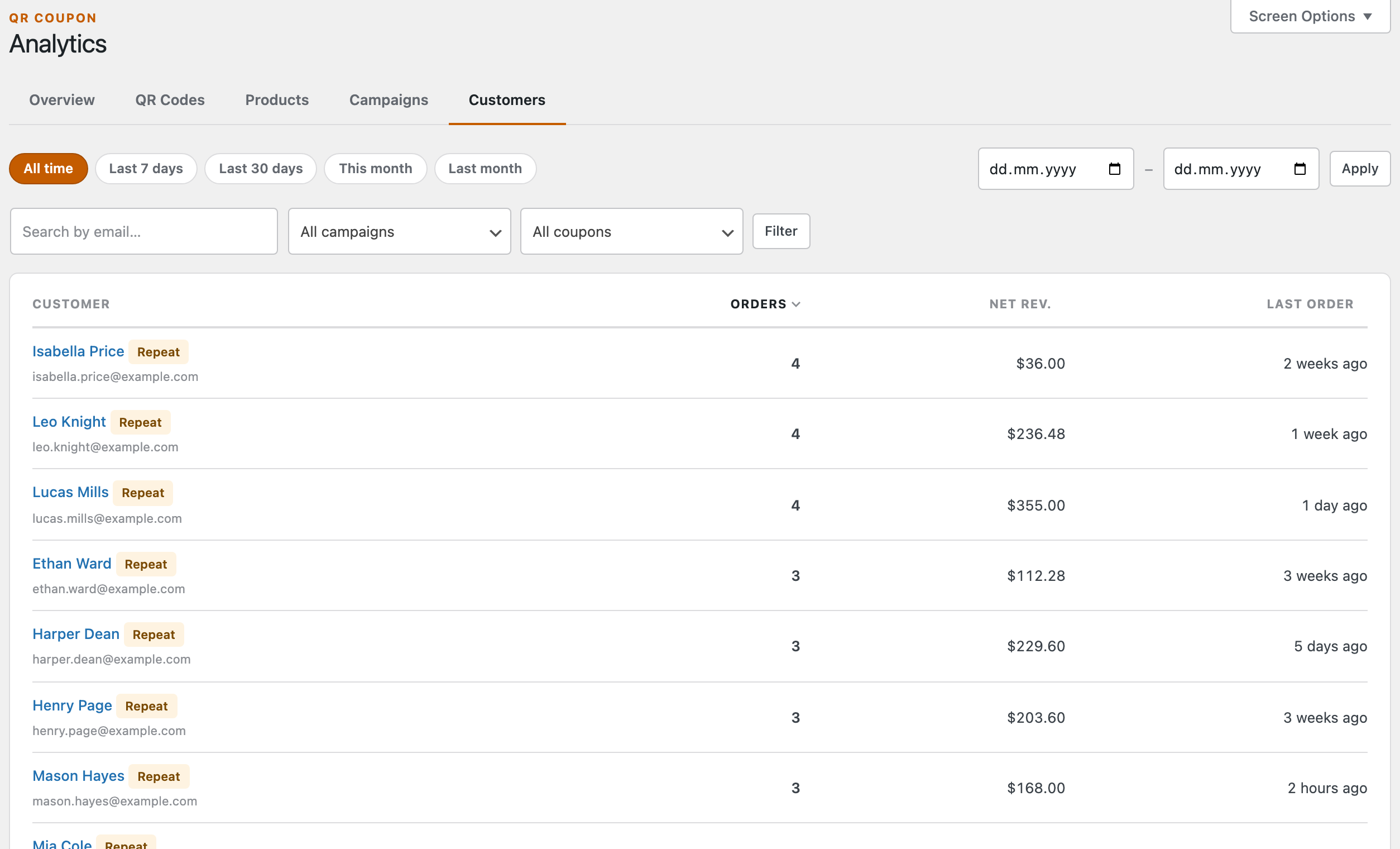
The view most stores overlook: the actual people a scan brought in. Sorted by order count so your Repeat buyers (more than one order — also your coupon-abuse signal) rise to the top, with Guest badges for un-registered shoppers, and filters for email, campaign and coupon.
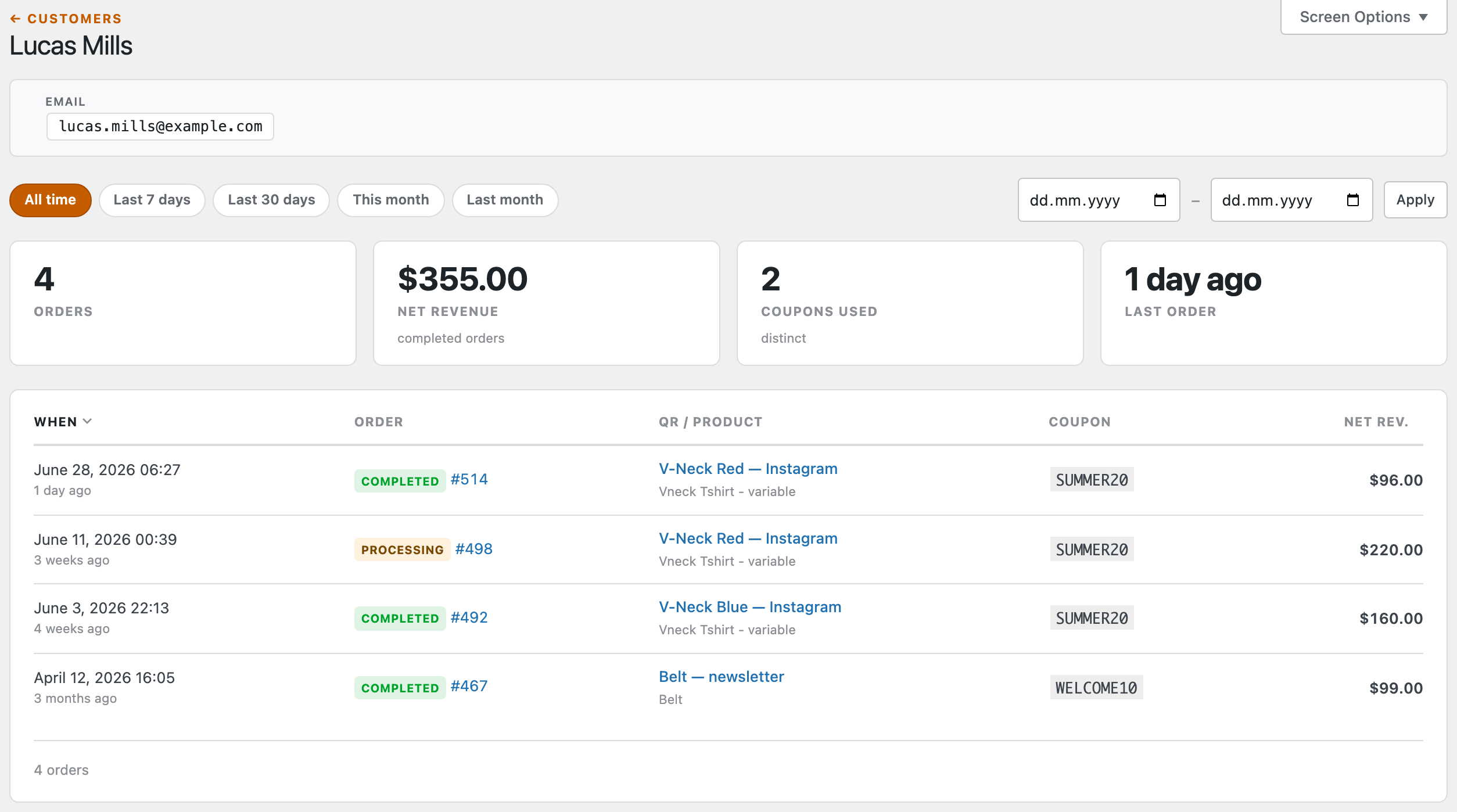
A customer’s detail page lists every QR-attributed order they’ve placed — with the order status, the code and product behind it, the coupon, and the revenue. It’s what turns “we printed some QR codes” into “this flyer brought in eleven customers, four of whom came back.”
How a sale gets credited. When a shopper scans a code and checks out, QR Coupon tags the order with the code and campaign behind it. Net revenue counts completed orders; pending covers ones still processing; cancelled, failed and refunded orders are left out — so the numbers track real money, not just clicks.
Next: Configure settings →